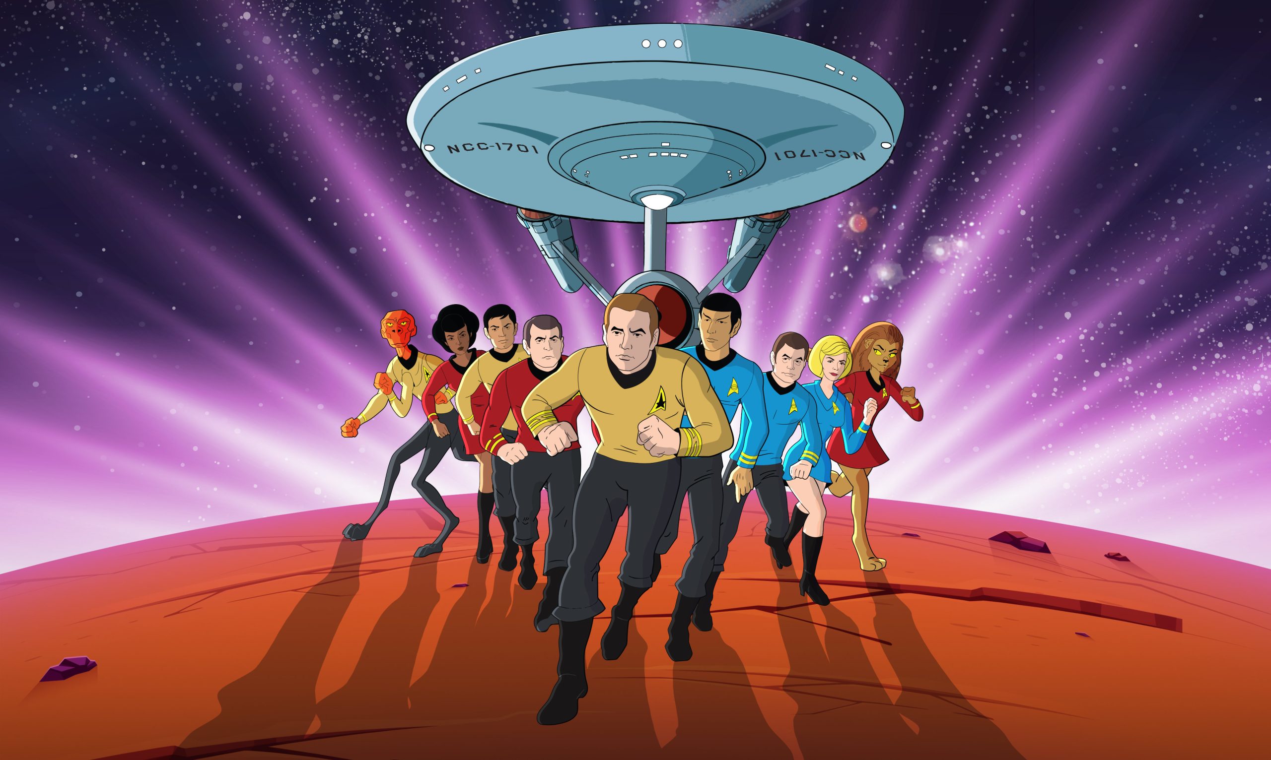
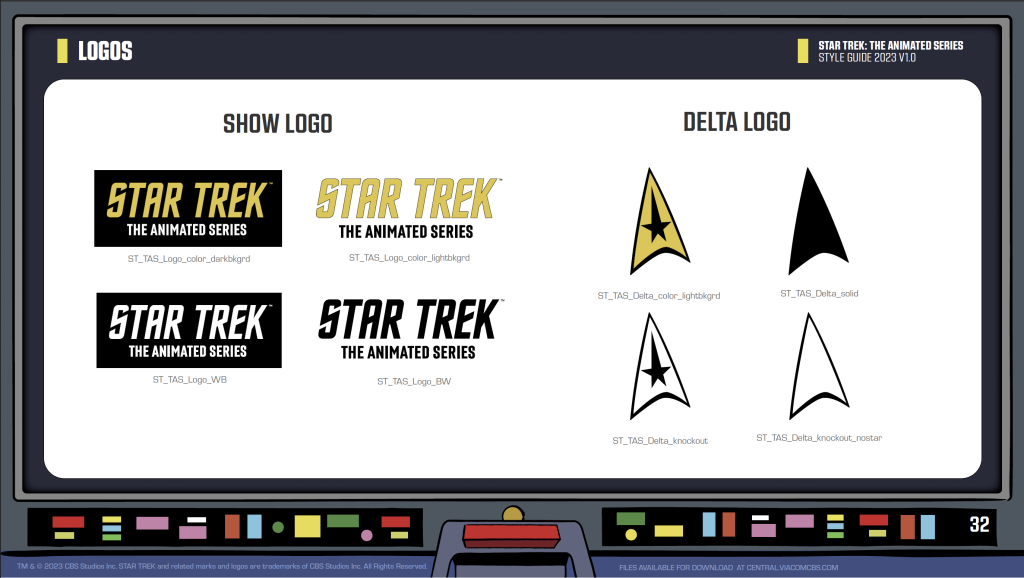
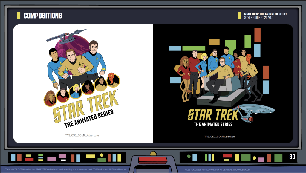
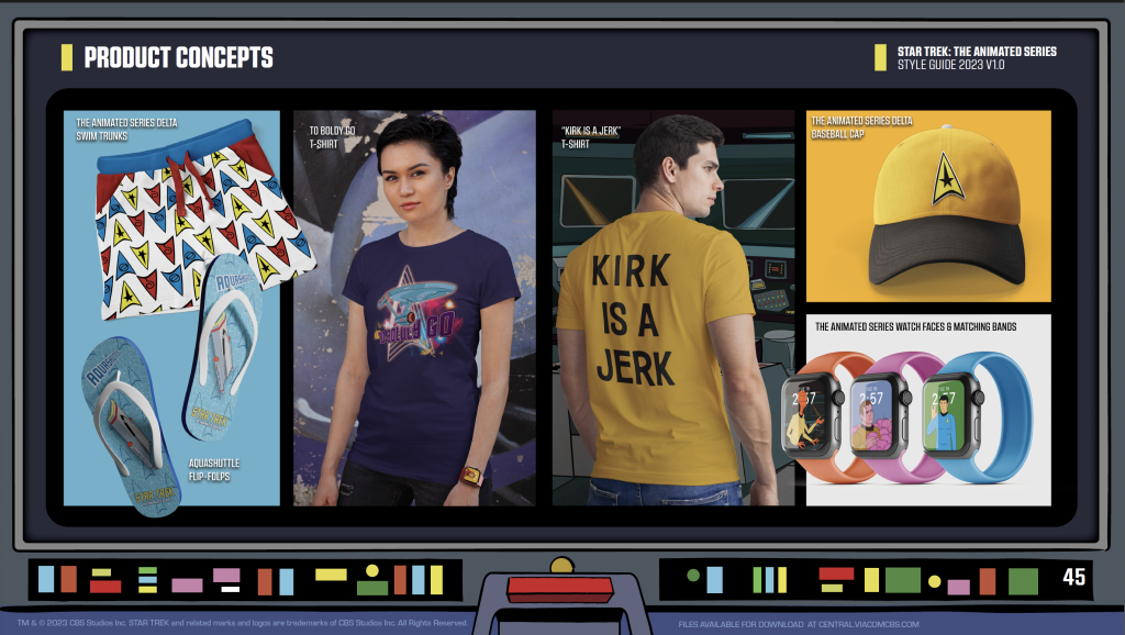
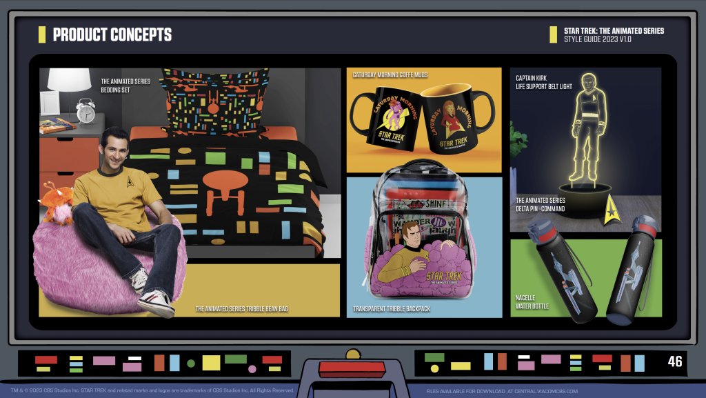
This past summer, Star Trek: The Animated Series celebrated its golden anniversary, and part of the celebration involved creating new merchandise for the animated series. The challenge was that the show, produced in 1973, predated modern computer-aided design and scalable assets, so CBS was left with grainy, low-resolution images—hardly ideal for producing high-quality merch like shirts, mugs, and other collectibles.
Moving a flagship video game from computer to consoles
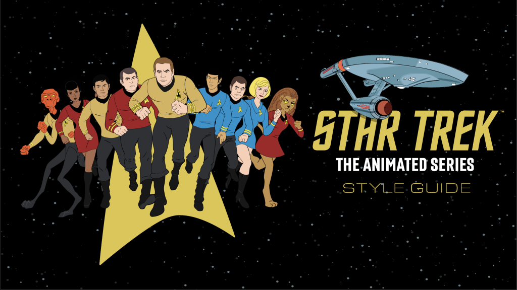
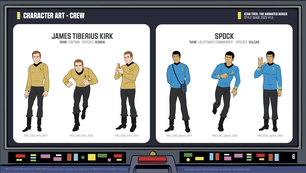
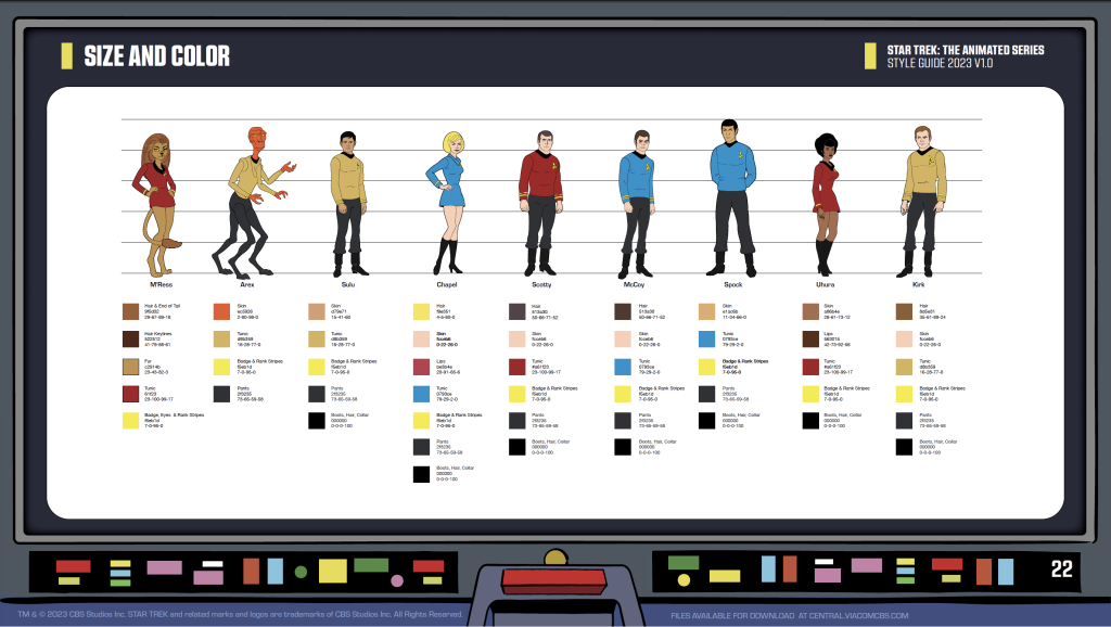
Since I had literally written (and designed) the book on TAS, CBS brought me on to re-create the graphics as if the show were brand new today. I set to work on reworking the original designs while staying true to the spirit of the series, creating a style guide that CBS and its licensees could use to bring TAS to life in fresh, exciting ways for fans old and new.
Modernizing assets
In the 1970s, cartoons were created using traditional hand-drawn animation, a labor-intensive process where artists drew each frame by hand on paper or cels (clear sheets of acetate). These drawings were then painted, photographed onto film, and assembled to create the animation. Backgrounds were hand-painted, and sound was added in a separate, often painstaking process.
Re-creating the hand-drawn look in a scalable digital format was a challenge because it required capturing the original textures, line inconsistencies, and unique imperfections that give hand-drawn art its character. Maintaining this authenticity while using digital tools often involves extensive customization to avoid the “too perfect” look that modern vector graphics can produce. Hard work but everyone was happy with the results!


L – Original pain and ink animation cel R – A modern day vector recreation


